Postmortem: ArimaMary's Site Homepage 2.0
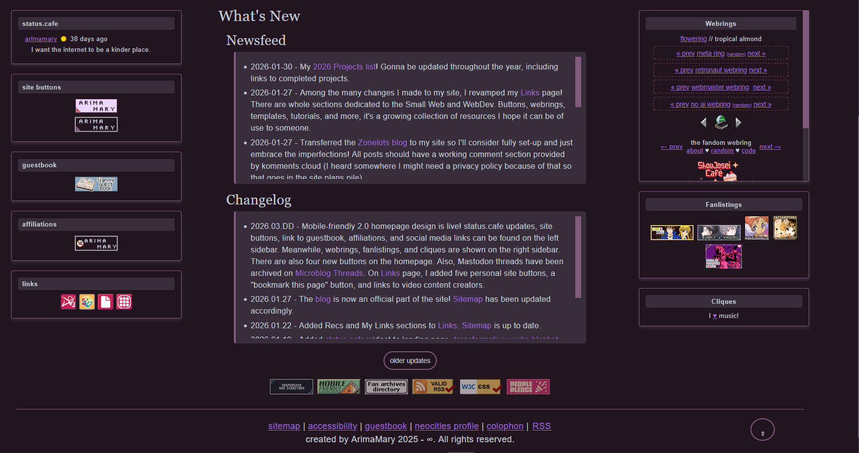
Second postmortem! This one is on a recently completed project, a complete redesigned of my main site's homepage. Behold the final result, on dark mode, as usual.
It's hard to believe and even more to say that it wasn't done with a layout generator. I had plenty of points of inspiration but no concrete ideas, so I decided to get down and dirty, testing any and all ideas that crossed my mind. While this is not my usual web dev process, I am immensely proud of the result.
This endeavor started with a two column layout with a left sidebar. Ah yes, I should first link to Kalechip's flexbox layout. Without it, this project would have never been possible. Back to topic, these two columns were similar to the layout on my status.cafe. I think this version's sidebar displayed my account's status.cafe embed and the social media icons. I tested the sidebar without any borders before trying to separated it from the main section with a dotted line. Didn't like either design.
Eventually, I considered using flexbox on the whole file and on the newsfeed and changelog sections, similar to my current homepage on my NSFW site. I believe by that point, I had moved the sidebar to the right.
Oh, a change I wanted to implement going to this revamp was removing the iframe displaying the guestbook. I had initially taken inspiration from Azure Mist's site. Then I saw another site using a sign the guestbook button and wanted to change the display to that format. It took some searching but I found a button I liked. In addition, I added a Newsfeed section which was inspired by NomNomNami's site although mine is an toot archive (Mastodon posts). In that same vein, I also imitated her archive with all updates from the past year, toots and site updates. I had already done this on my NSFW site so I just copied the code over. Very convenient!
In hindsight, this ordeal can be divided into two sections: HTML and CSS. The new sections are HTML and the layout is CSS.
For the layout, I struggled with the number of columns. I was sure I needed at least one sidebar but I didn't like how a single sidebar layout looked. I don't think I got the idea of making my neighborhood into a sidebar until way late into the process. I think it was Aid's site that led me to try that as well as aBunnsLife three column layout.
So I went from a left sidebar to... wait I actually started from a right sidebar to a left sidebar. This was because I didn't like how my eyes flowed from the right sidebar when I had to read from left to right. Despite moving the location of the sidebar, it was also a big nope.
After some agonizing, I went for the three column layout and when it clicked, it clicked. I had found the golden ticket! That was IT.
I ended up scrapping all use of flexbox for the newsfeed and changelog. I tested placing the changelog on the sidebar but the matching style on two different places looked horrid. It was then that I tried placing them side by side and it was a struggle to make it work. For these reasons, just left them as blocks one after the other. That in turn also made the older updates button make sense because it lead to a page related to both blocks so all's well that ends well.
The buttons, the thin ones and 88x31s gave me a bit of grief. I considered mimicking petrapixel's design choice where her buttons where next to her intro but in the end, I didn't even dare. Placing the buttons in the sidebar would have been a good option, but after I added some 88x31s (People's Pledge and validators) I realized there were enough 88x31s to make a small batch. Thus, I switched Responsive Web Directory's 88x16 with an 88x31 before moving all of them to the bottom of the main section and BAM, the pieces fell to place. I made a last minute addition with Debtdeath's mobile friendly button. I worked really hard to make this site responsive and I wanted others to know! Although it was mostly because I had seen some sites that say their sites are best view on a desktop and well, mine wasn't! 😂
Unrelated to this project, I did edit another page. I wanted to add flexbox (I have been obsessed with it since redesining my NSFW site's homepage) to my About page but it didn't work. I just couldn't figure out why so I gave up. At least I added semantic tags so that's a win on my book! (´ ∀ ` *) .
What else? I think this is a good place to shout out the several personal sites I looked at that haven't mentioned yet. These are pomnavi, Oaaky's World, and The Museum of Xandra.
After I had my base layout, I tried several ways to display each section of the sidebars. I was hellbent on two design choices 1) keeping it minimal and 2) giving a specific background color to each subtitle, another nod to my current status.cafe design. While I tried going borderless at first, I eventually settled on zhongvie's card style. It was tough to mimic it with a three color palette instead of four but somehow I managed. The shadow gives it the sliiightest bit of a pop to an otherwise minimal design and I think it looks really pretty on dark mode (≧◡≦) ♡.
After I had caved in to the use of borders, I replaced the background color of the text-based webrings (which had the same color as its section title) with a dashed border.
I think that's all I have to say about this undertaking. Thanks for reading!